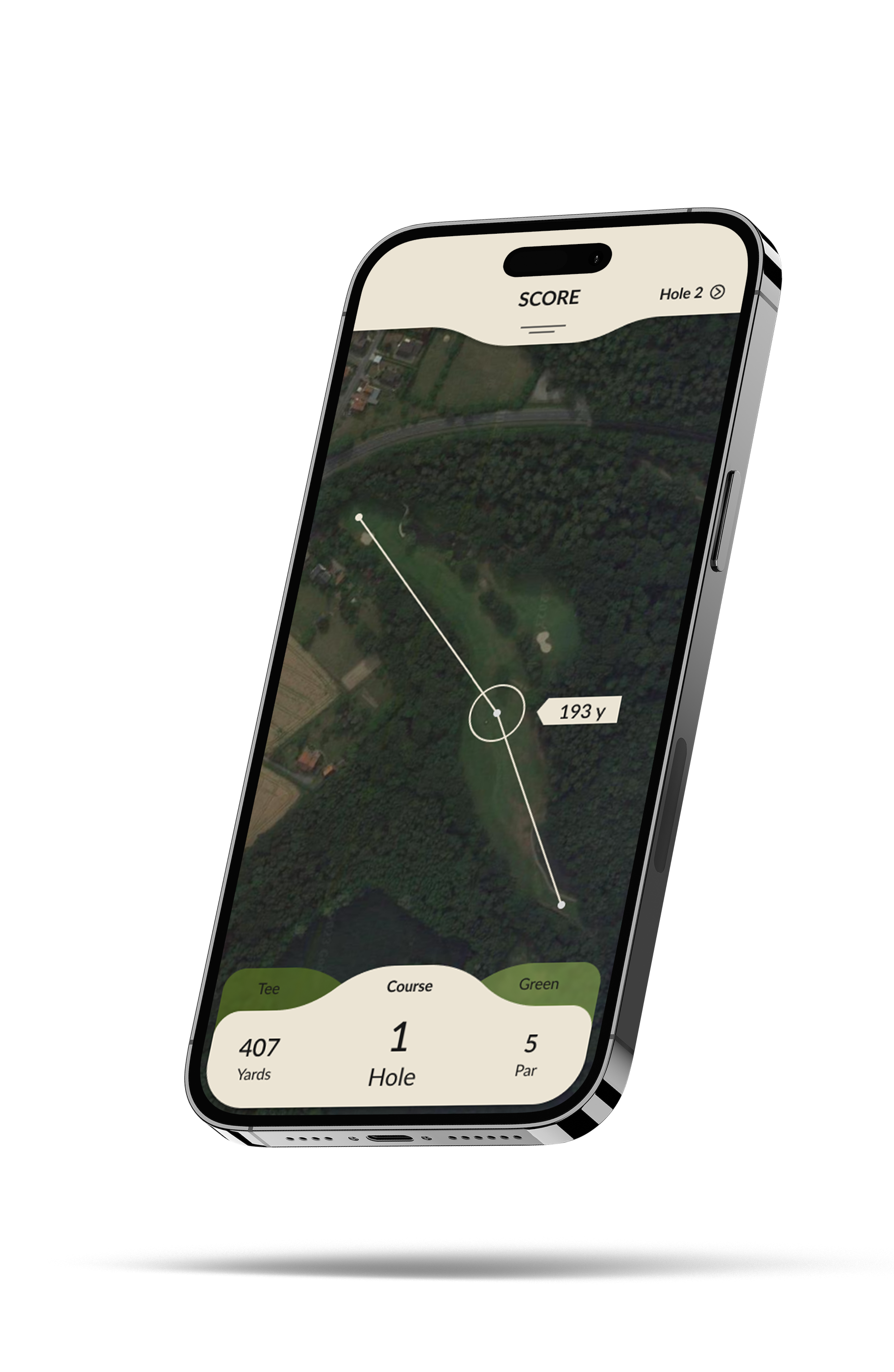
Golf-App
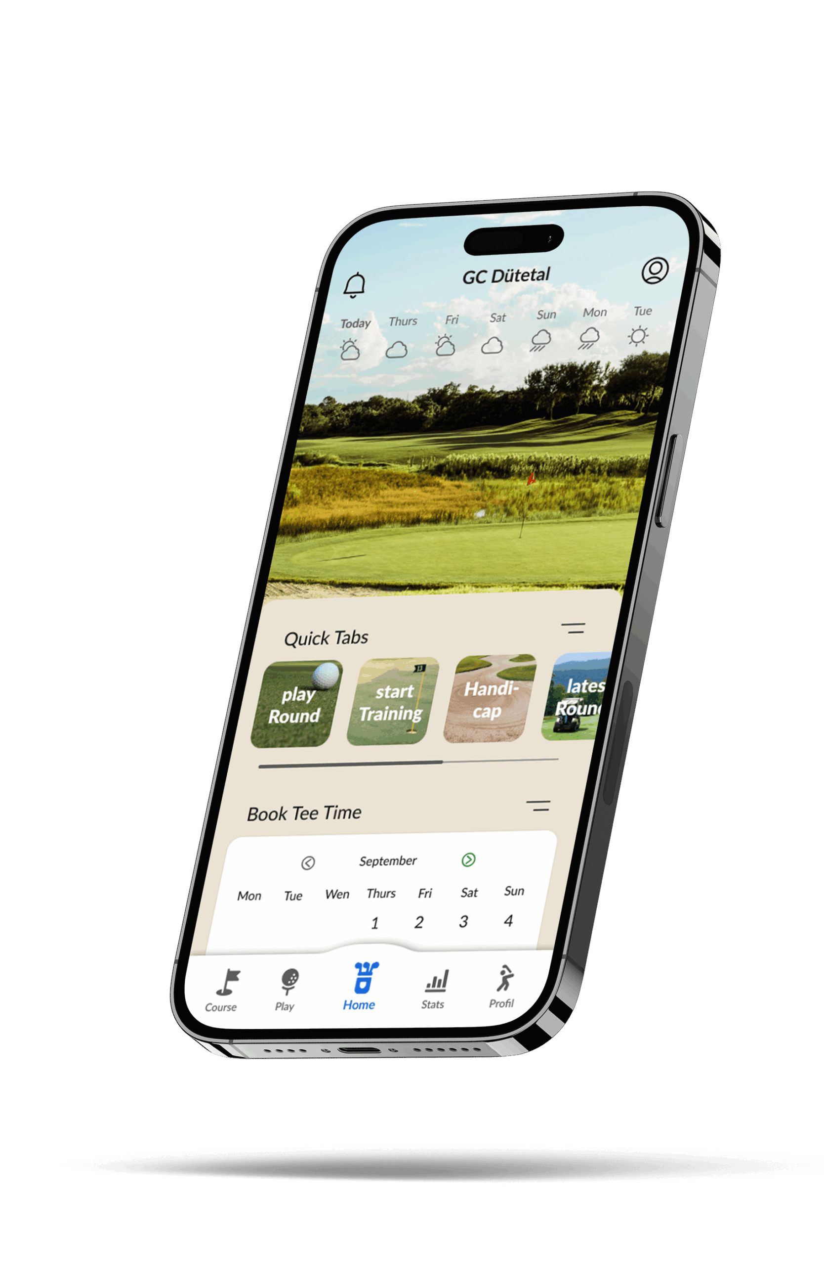
In addition to my studies, I also designed an app that deals with my hobby golf. During the years I’ve been playing now, I’ve noticed a lot of little things that this app is supposed to solve.
Golf-App – Understanding Our Users
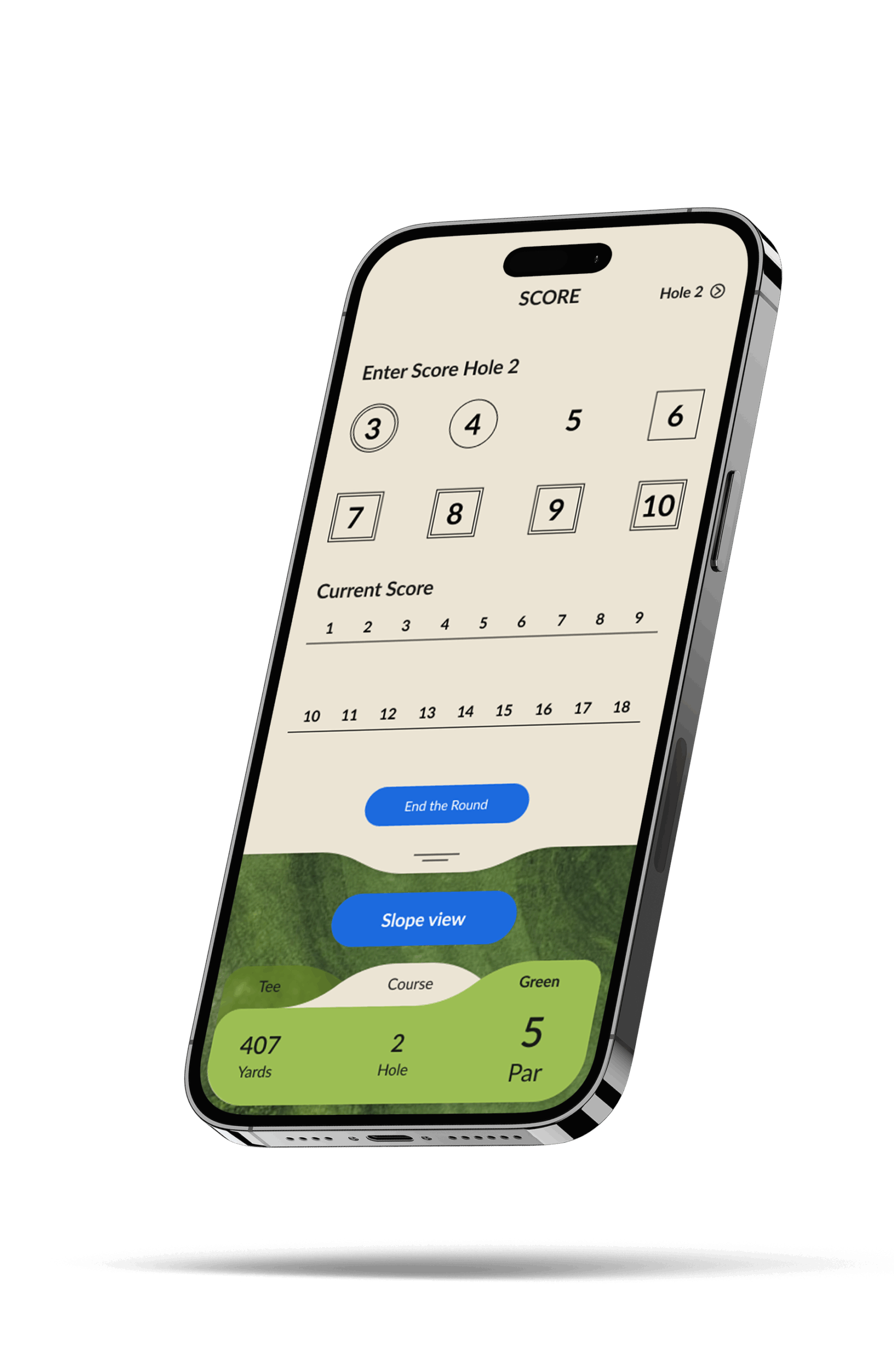
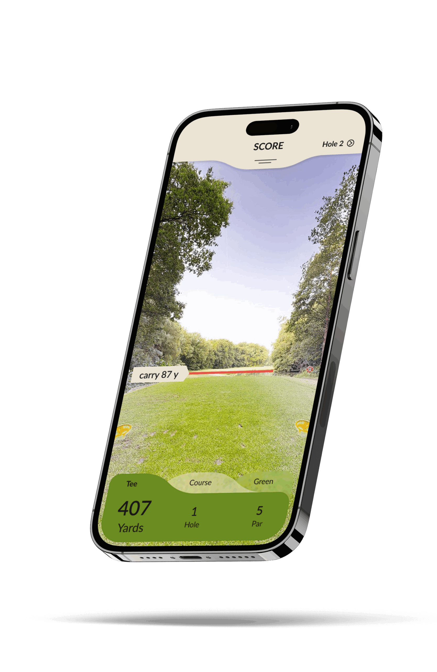
In the course of the research, I started to note problems that other apps have. One important point was that I wanted to create an app that was designed for the individual golf clubs. Although there are many independent providers, additional applications are still needed, e.g. to book tee times, retrieve current course information, live scoring of tournaments and much more. All this information should be listed in my newly designed app.
Below you can see the most important problems that I noticed as a user.
All functions in one place
The most important digital functions of the golf club should be combined in one place
Freedom of customization
Each member should have their own individual start page for maximum efficiency
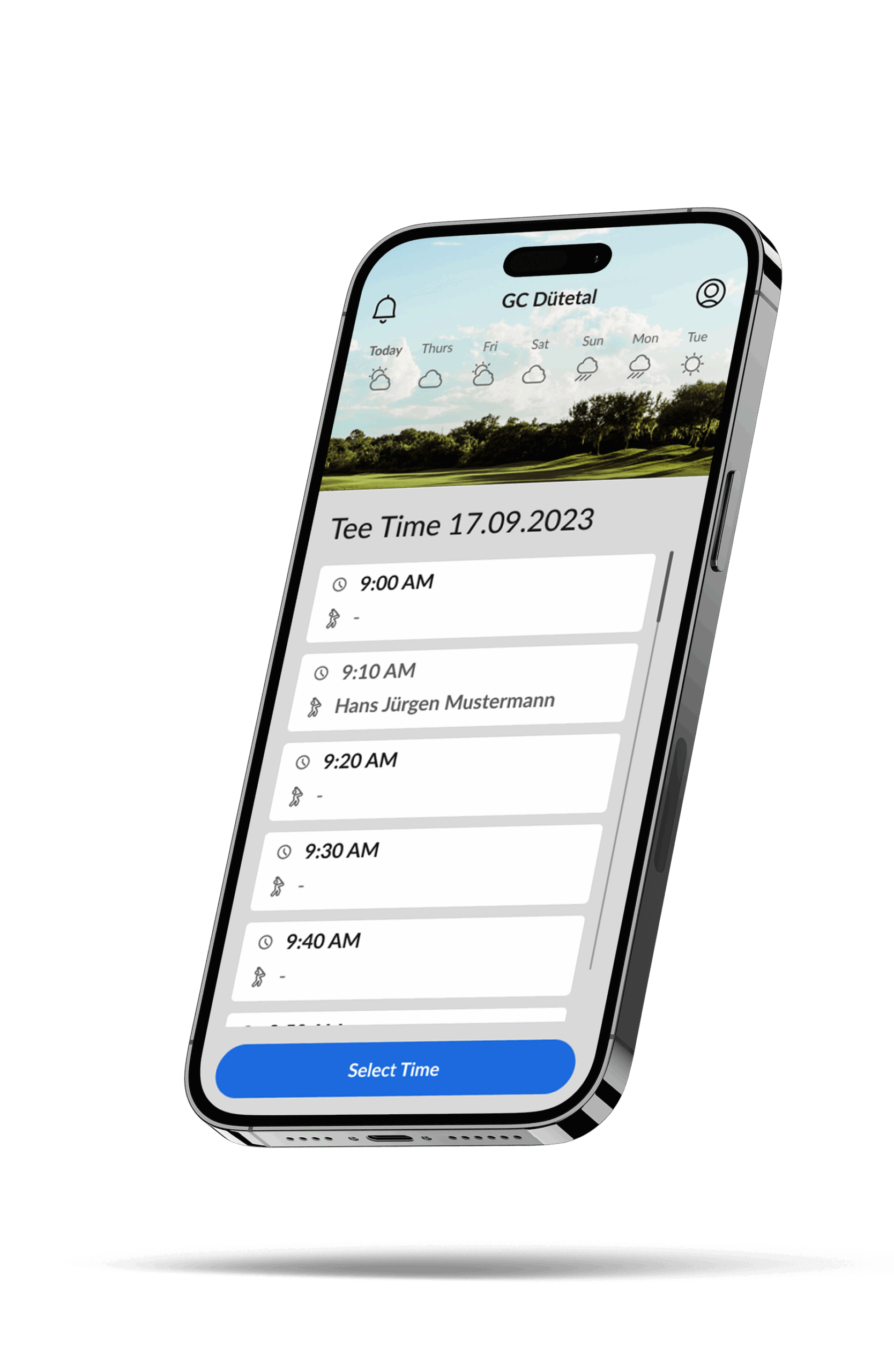
Book Tee Times
Booking tee times in other clubs should be easy via a form without much effort
Shortcuts
The user should be able to create shortcuts with the most frequently used functions
Handicap
Official handicap and personal handicap should be distinguished
Monitor tournaments
Game management should be able to see where players are in a tournament at all times and intervene if necessary
User Flow
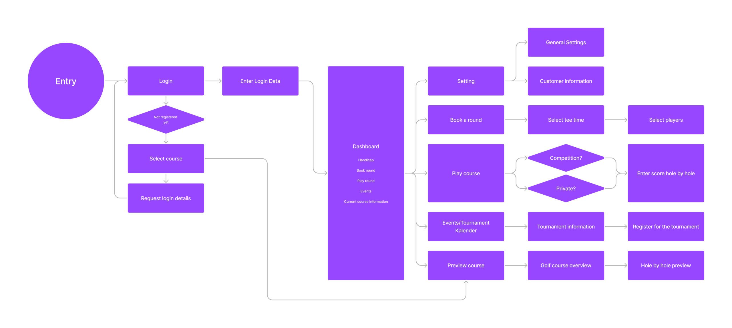
After conducting an in-depth analysis, I have mapped out the user flow for my app and represented it visually in a graphic. This detailed examination allows for a clear understanding of how users navigate through the various features and functionalities, ensuring a seamless and intuitive experience within my app.
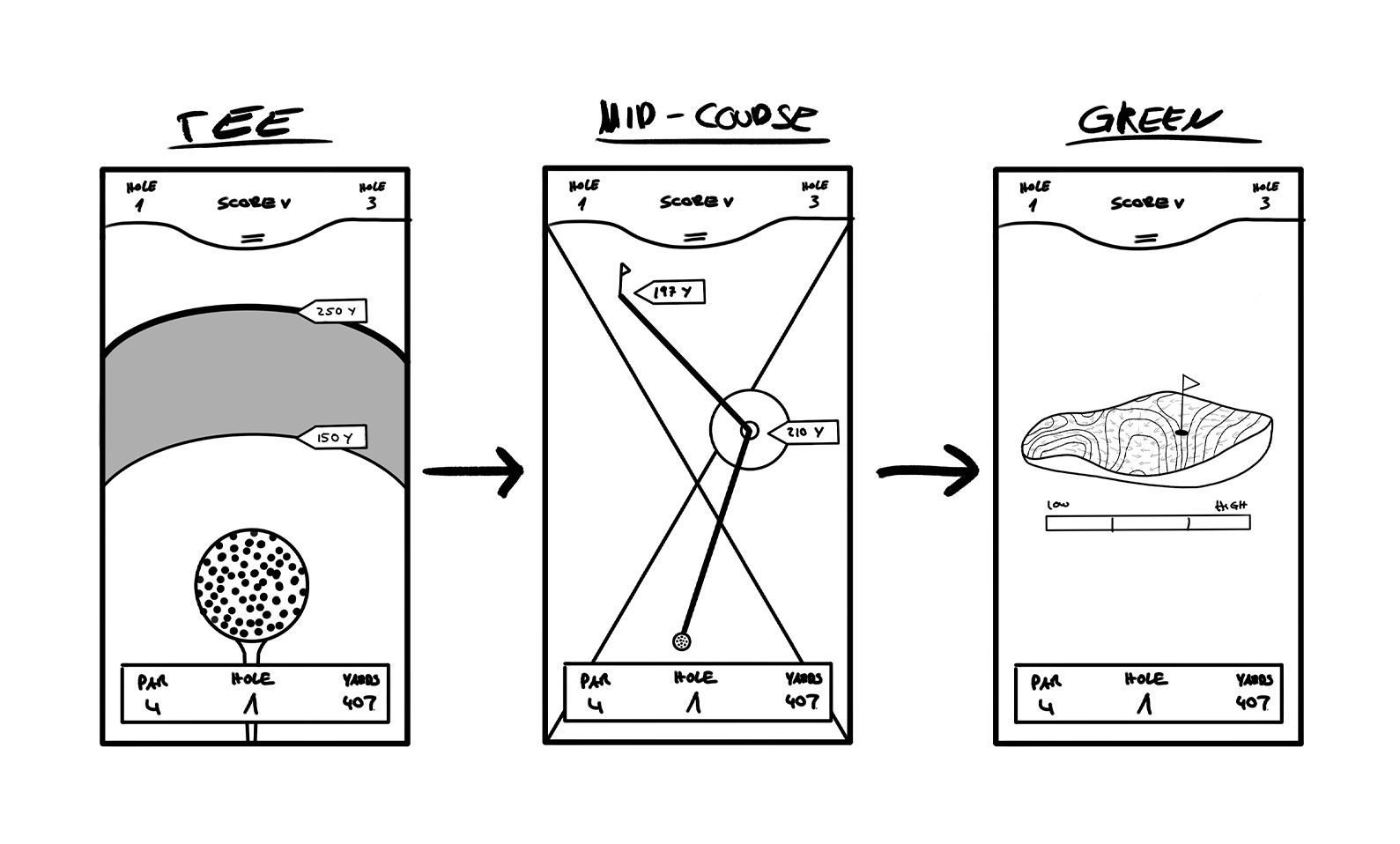
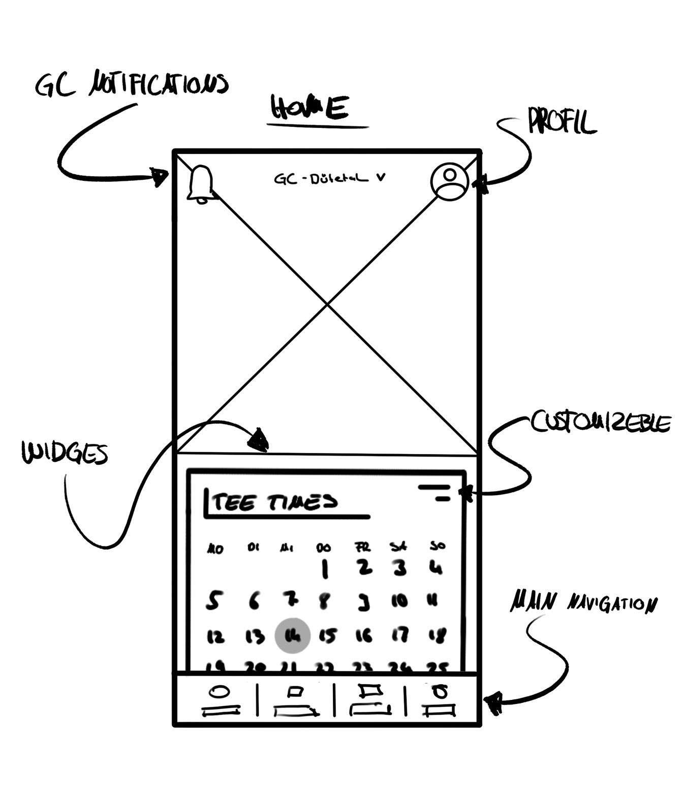
Rough layout as wireframe
After I had worked out my concept, I visualized the templates as a wireframe. I tried to work as simply as possible so as not to limit my design later on. The graphics shown here are only an excerpt of my work
Designing the app with figam❤️
I began by examining the specific elements requiring design within my wireframe. After predefining these elements, I systematically assembled them into the respective layouts. Throughout this process, I adhered to the principles of the atomic design approach, consistently keeping it in mind as I constructed each page.
Animated click dummy
Once the templates for the app had been designed and built, I moved on to animating the click dummy using Figma. By leveraging a variety of interactive functions and prototyping tools, I was able to bring the dummy to life and provide a realistic demonstration of how users would interact with the app. This included transitions, button states, and flow animations that effectively illustrated the intended user journey and operational logic of the application.
Below, you will find a video showcasing the animated click dummy and its interactive features.
